- Add widgets
- Survey Comparison
- Heatmap
- Confidentiality Settings
- eNPS in Workforce Analytics Portal
- Notes Widget
- Text Analysis Widget
- Response rate
- Text Report
- Trend analysis widget
- Show/hide Markers and Building blocks
- Question Filter
- Single Question Widget
- Heatmap default
- Sentiment analysis
- Scorecard
- Driver analysis
- Scorecard: All options view
- Heatmap Column Types
- Multiple Tabs in a Dashboard
- 360 feedback introductory text
- 360 feedback display configurations
- 360 feedback display labels
- Multi Level Priority Logic
- 360 Surveys- Priority Model
- 360 feedback - skip logic
- 360 feedback - show hide question logic
- 360 Survey Settings
- 360 feedback configuration
- Customize the validation text
- 360 Survey design
- 360-Reorder section
- 360 Section Type - Single Select Section
- 360 Delete Sections
- 360 Add Sections
- 360 section type - Free responses text section
- 360 Section Type - Presentations text section
- 360 Section-Edit Configurations
- 360 Survey- Languages
- Matrix section

Heatmap Analysis
Heatmap widgets offer a comprehensive, industry-grade visual representation of performance indices across your organization. They excel at showcasing demographic comparisons, highlighting macro-level sentiment high and low points, and illustrating how different custom field variables perform against core engagement items. By mapping complex data metrics onto a color-coded matrix, leadership can instantly identify operational highlights and areas requiring targeted action planning.
Watch this quick walkthrough to understand how it works:
Click to download video
To create a heatmap, log in to your Employee Experience account and execute the following steps:
- Navigate to the EX Portal, and select an existing reporting dashboard or create a new one.
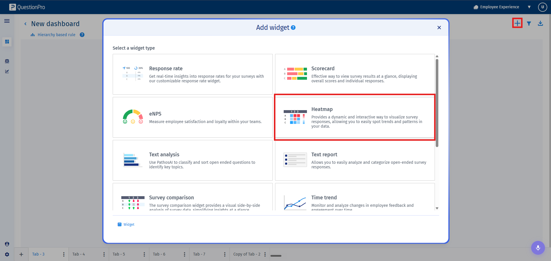
- Within your active dashboards, navigate to the needed tab and click on Add Widget. From the available widgets menu, select Heat map to launch the creation flow.
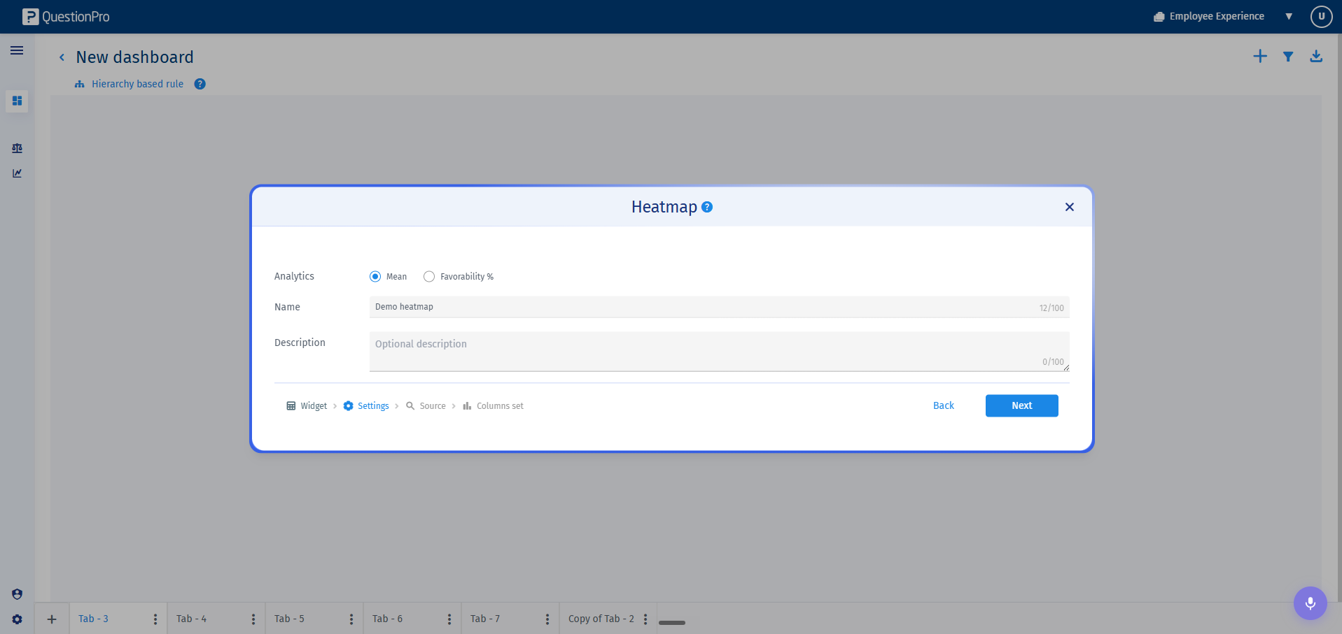
- Step 1: Widget Parameters and Display Analytics
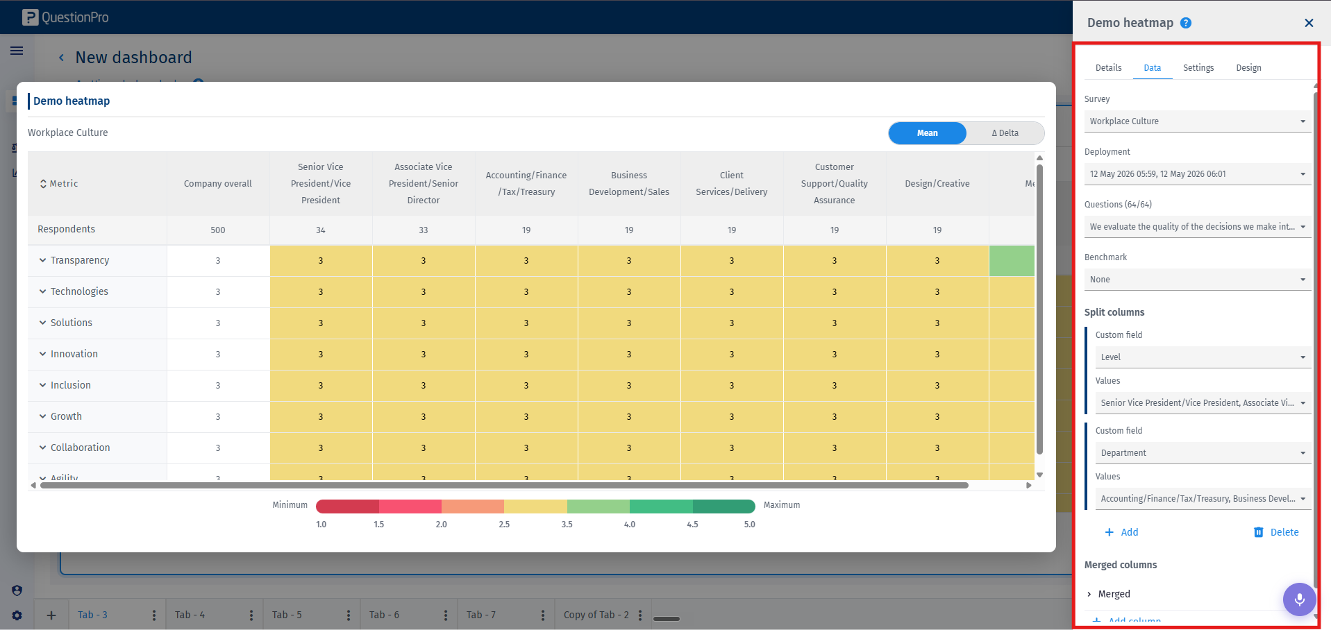
Provide an explicit widget Title and include an optional Description. Under the core configuration settings, select your preferred analytics display options, Mean, or Favourability calculation profiles. - Step 2: Data Source Mapping
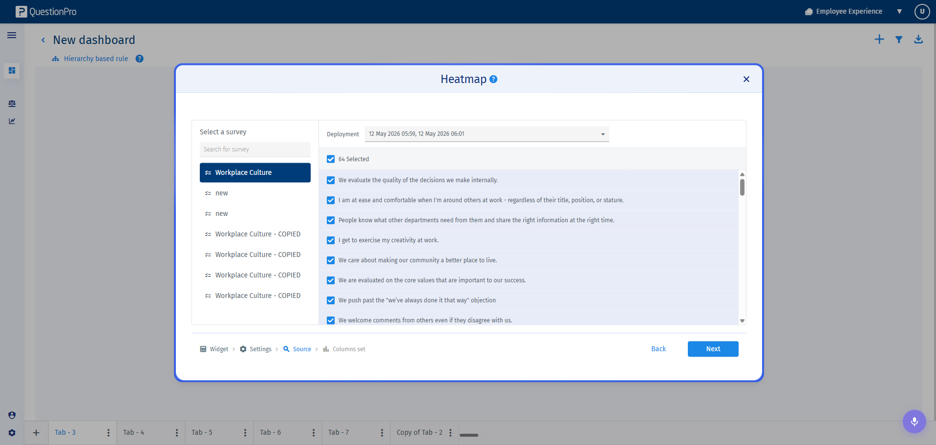
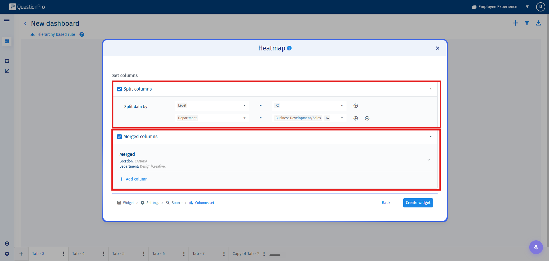
Select the source Survey, along with the specific historical or active Deployments and Questions. - Step 3: Column Structural Architecture
Define how your matrix columns are to be generated. The dashboard offers three advanced column structures to handle custom field comparison visualisation:- Split Columns: Automatically splits and generates distinct, isolated reporting columns for each specific custom field value combination. This allows for multiple custom fields to be structurally evaluated side by side simultaneously.
- Merged Column: Consolidates data fields by blending filters across completely different custom fields, aggregating the target parameters into a single unified column view.
- Preset Column: (Currently in Beta Mode) Allows administrators to create pre-defined column layout standards and intentionally assign them to specific stakeholders or downstream managers when securely sharing dashboard access.
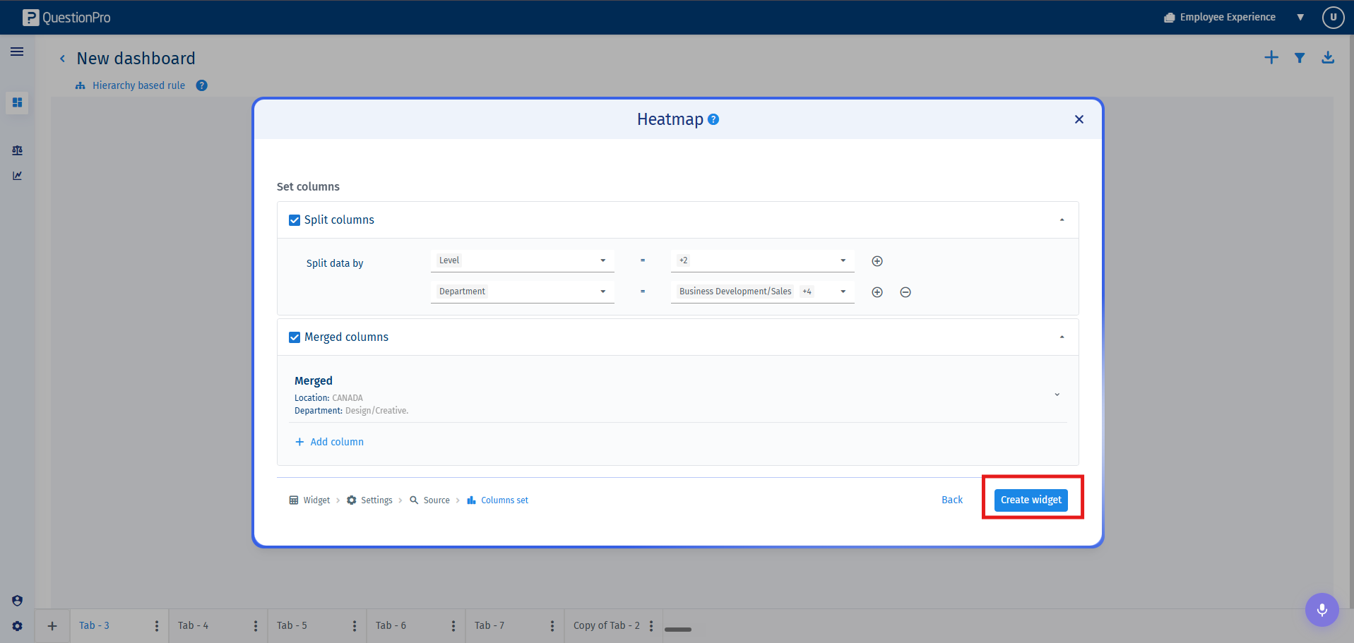
- Click on Create Widget to render the visualization. If you need to void the operation, click Back.
Once generated, a heatmap widget can be customized or maintained to modify display thresholds or comparative baselines:
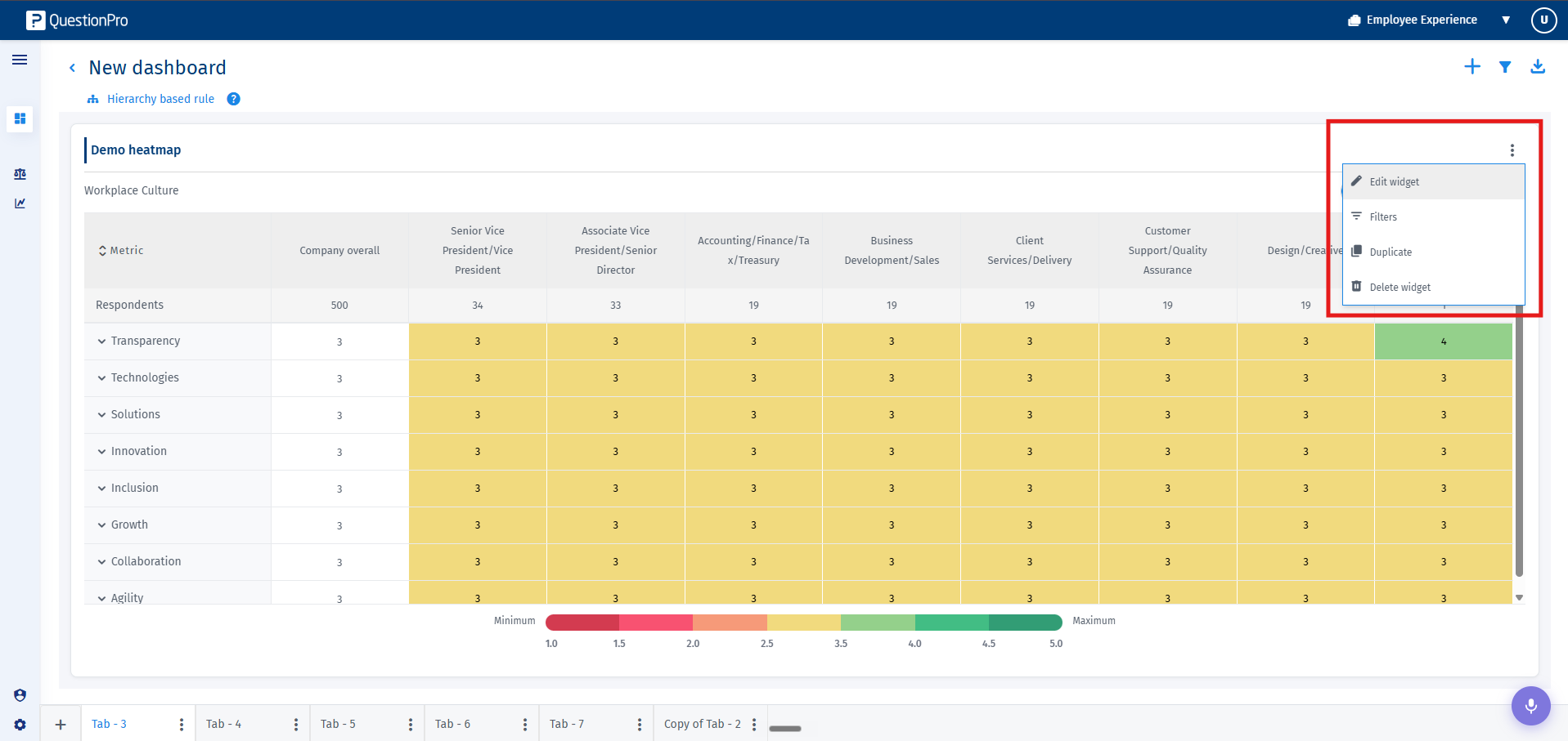
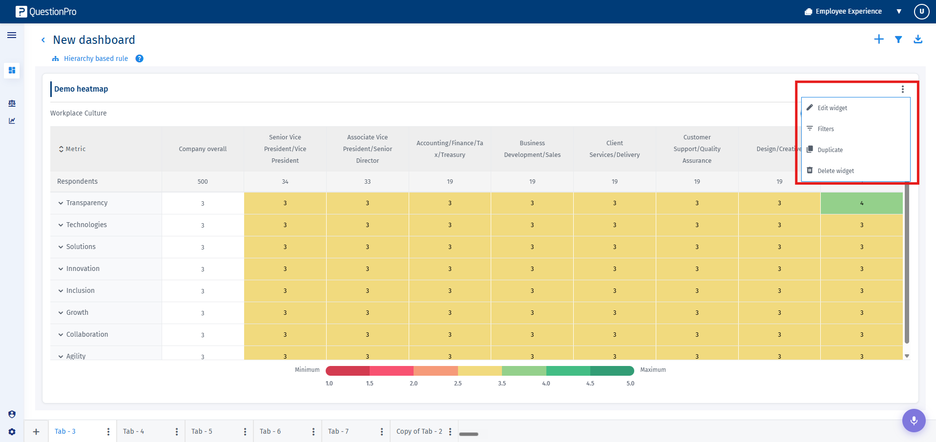
- To update criteria, change column types, or switch analytical calculations, click on the three-dot kebab menu icon in the upper-right corner of the widget frame and select Edit Widget.
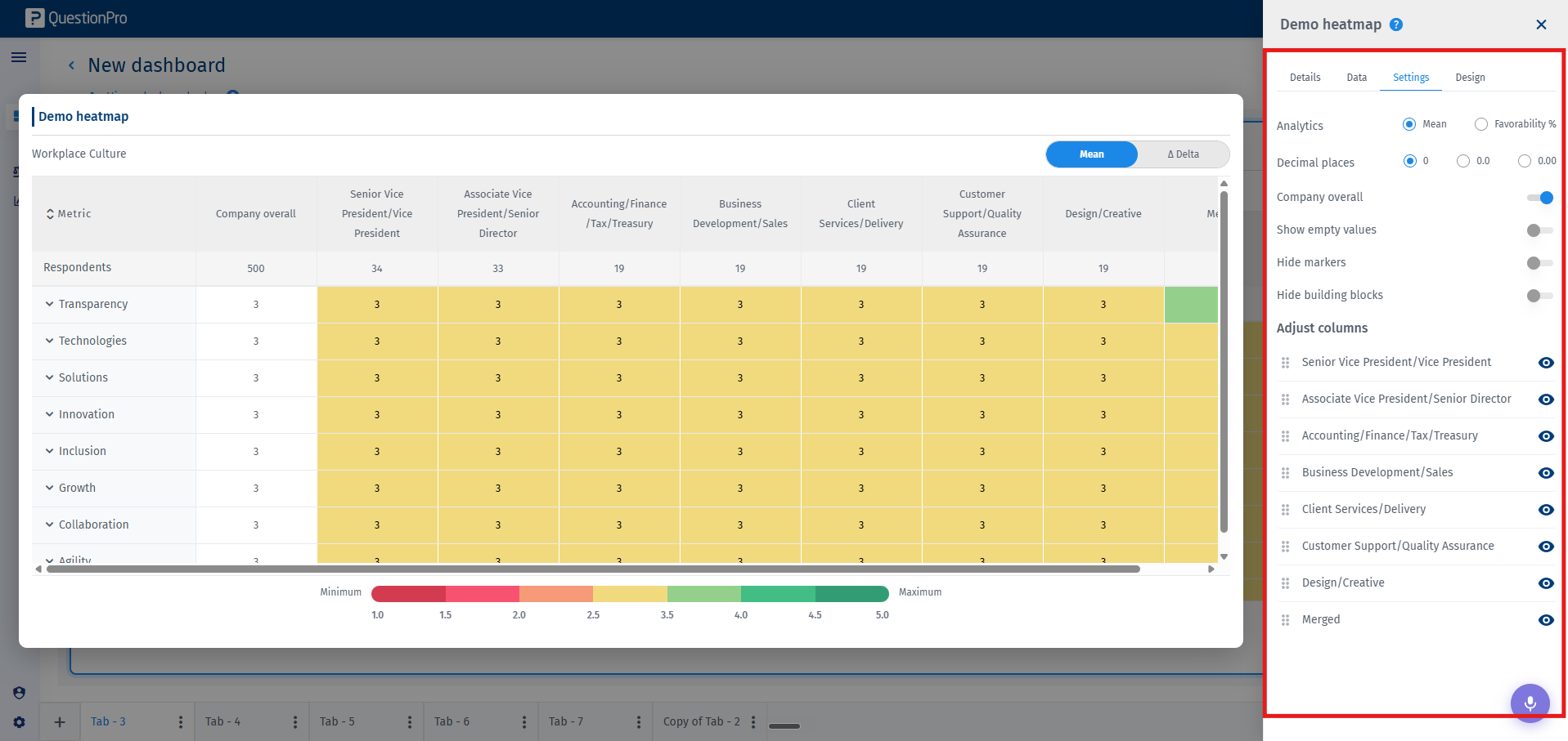
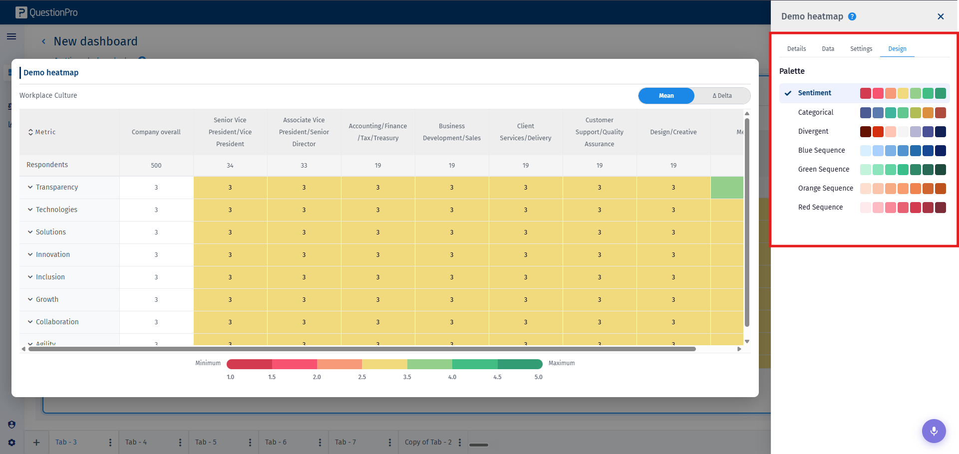
- The formatting inspector panel provides access to the following presentation controls:
- Update Data: You can update the survey, the deployments, questions, and the column setups here.
- Add or Change Benchmark: Compare real-time data against historical corporate baselines or target industry indices.
- Company Overall Toggle: Enable or disable an aggregated institutional overview benchmark line item.
- Analytics Aggregation Type: Instantly change the calculation algorithm between score Mean, Decimal precision modes, or Favorability models.
- Empty Value Visibility: Toggle to display or conceal items returning null or having zero respondents.
- Column Visibility and Reorder: Dynamically reorder, isolate, or mask distinct columns within your active matrix.
- Color Palette Matrix: Personalize standard visualization gradients using divergent or sequential company-approved spectrum themes.

- Replication, Maintenance, and Exports:
Through the options in the kebab menu, you can duplicate the widget or execute full widget deletion. The Export option is available at the Tab level, where you can choose the widgets you would like to export. It lets you extract the heatmap data as an operational Excel, PDF, or an editable PowerPoint file.